
Rockford IL – Housing Affordability
Last week’s post, answered the question of what is affordable housing? As you may recall, housing affordability means the sum of rent or mortgage and housing related costs (i.e. utilities, insurance, and real estate taxes for homeowners) is no more than thirty-percent (30%) of a household’s income. I also noted in last week’s post that this week we would focus on affordability in Rockford, Illinois. Today’s post is all about my hometown yet, if you’re not from Rockford, the content is relevant as I will provide links so you can assess your own communities’ data.
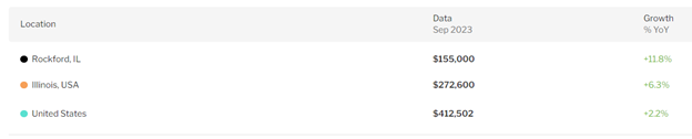
If you are a Rockfordian, we’ve long heard how affordable our housing market is. In August, Rockford median home sale prices rose to a high of $155,000. Despite the high, REDFIN reports, local home sale prices remain lower than the state median sale price for the same period; lower by nearly $118,000 and just about $257,000 less than the national median home sale price for the same time. By comparison, our prices are definitely lower, but that doesn’t equate to affordable for those who call Rockford home. It should also be noted that Rockford also broke median listing prices in September, the third month in a row, where those homes coming to market are priced in excess of $200,000.
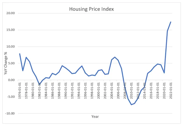
Looking at the Rockford Housing Price Index, above the near 18% 2022 increase in value, when added to the near 12% 2023 increase is placing more homes out of reach of existing Rockford residents. At the same time, inflation across living expenses is driving housing burden, or a condition where housing costs exceed 30% of household income, placing more residents in a state of housing burden. When burden rates rise, studies show residents forego other expenses like home and auto repairs, preventive health care, and educational expenses.
Homeowner cost burden rose to just over 19% (or nearly 1 in 5 homes) in 2021 affecting nearly 18,000 homeowners. 2023 burden is now trending closer to levels we haven’t seen since the 2008 great recession; a condition that contributed to the last significant wave of foreclosures.
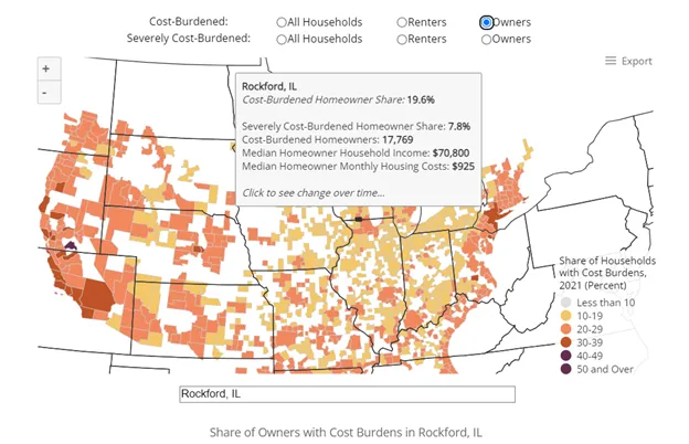
JCHS reports severely cost burdened homeowners, those who spend more than 50% of their income on housing related expenses are closing in on 10% (2023) of area homeowners. The numbers are drastically worse for our community’s renters.
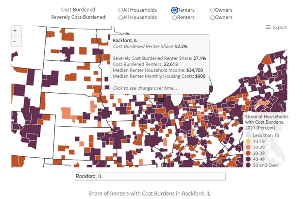
JCHS reports in 2021, when area media rental costs held at $900, 52.2% of our renters were cost burdened; a total of more than 22,000 renters. Additionally, JCHS reports nearly 30% of renters are extremely cost burdened or spending 50% or more of their income on housing related expenses. We also know that when renters are burdened, they forego household expenses such as health care and transportation expenses that can affect their ability to remain stable in the workforce. The fair market rent in 2024 will rise to $1,031.00 (Department of Housing and Urban Development) and expectations are that the burden rate for renters will also rise.
Not a Rockfordian but interested in how your region fares? Use the hyperlink to JCHS to review your region.
These increasing local prices, whether for sale or for rent housing, is in part driven by national conditions (i.e. interest rates, construction prices), but is predominantly driven by a lack of quality local supply.
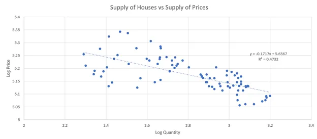
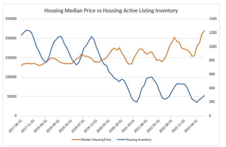
In the preceding chart, the Rockford supply of homes vs. prices shows regression, meaning that as price rises, there are fewer homes in the market for sale. This is not uncommon; however, with fewer homes in the market, there is also more pressure to push prices upward. Perhaps the effect of these conditions is more evident in the following chart where the gap between housing price and inventory continues to widen.
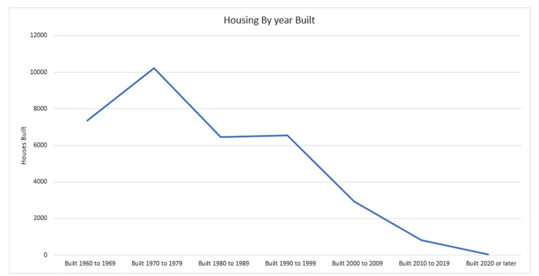
One could cite that the whole nation has been underproducing both single family and multi-family homes, a true condition driving prices upward; however, locally we have produced no real new inventory for fifteen years running. The following two charts demonstrate our historic housing production cycles and our permit activities compared to the Midwest and the Nation.

If one considers simple market drivers, such as when price goes up, developers and builders respond by building new products, we have to ask why is the only activity we are seeing in the downtown core with the adaptive reuse of historic vacant property? As a developer, I know the reason production is focused on historic adaptive reuse is because the historic tax credit (federal and state) is providing 45% of the capital to incent the repurposing of these buildings. This incentive fills the gap between cost and price – a condition we will explore in detail in a future post.
As community members we should be concerned that builders and developers aren’t responding with the production of new construction single and multi-family housing. Additionally, more than 75% of our housing stock was built prior to 1980 and we should be concerned about this aging stock AND the lack of new production. Over the coming weeks, we will look at many of the drivers that are holding production back – from national to local. Please continue to join us as we provide answers to the challenges of national, state, and local housing conditions and production.
Many thanks to Carlos Martinez, Rockford University, for his assistance and support in this post.